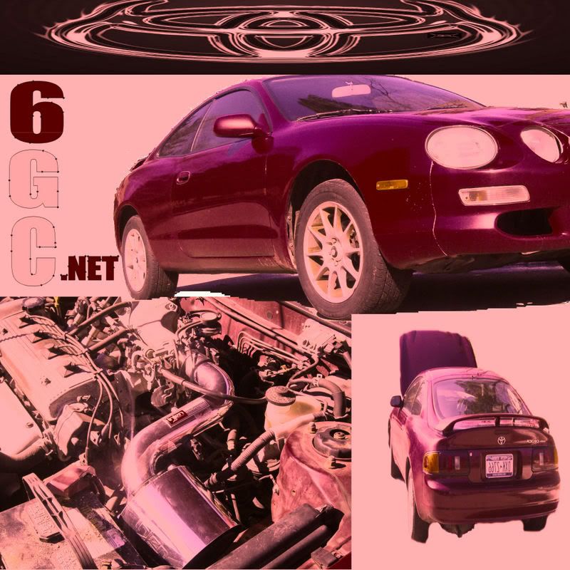
>
QUOTE(cel97ica @ Apr 3, 2007 - 6:26 PM) [snapback]542876[/snapback]
>
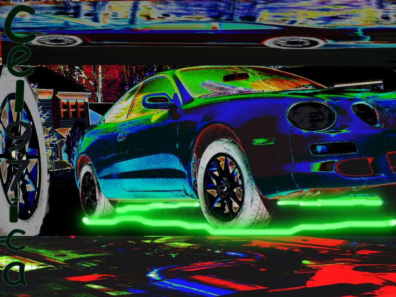
just finished took like 10 min anybetter??? after i finished i thought about some stuff i could of added maybe ill fix it then put the remade up
No offence.. but keep at it

Here what i would say
1) too much skew on the upper embelem
2) Very bad job of cutting objects out... The muffler isint round, i see white space under the car and... a square out of the tire ???
Did you do this in paint? If not... spend a bit more time cutting out your object.. use the magnification tool and carefully select your edges. Try using a bit of blending when pasting objects. Good luck

 >
>